You may have noticed that the Indices of Deprivation for England were updated and released in November 2025, and this has given us an opportunity to revisit a project that was initiated by Jamie Whyte back in 2018—visualising the relationship between deprivation and political control in English local authorities. The Index of Multiple Deprivation (IMD) is periodically released by the UK Government’s Ministry of Housing, Communities and Local Government (MHCLG). The last two indices were released in 2015 and 2019. The IMD is a relative measure of deprivation for the whole of England, broken down into small neighbourhood areas containing approximately 1,500 residents called Lower Super Output Areas (LSOAs). It measures deprivation across seven domains:
- Income deprivation
- Employment deprivation
- Education, skills and training deprivation
- Health deprivation and disability
- Crime
- Barriers to housing and services
- Living environment deprivation
The IMD is considered one of the most valuable datasets released by the UK Government as open data, as it underpins a huge amount of public policy, funding allocation, and health and education initiatives, as well as being used by a wide variety of commercial organisations.
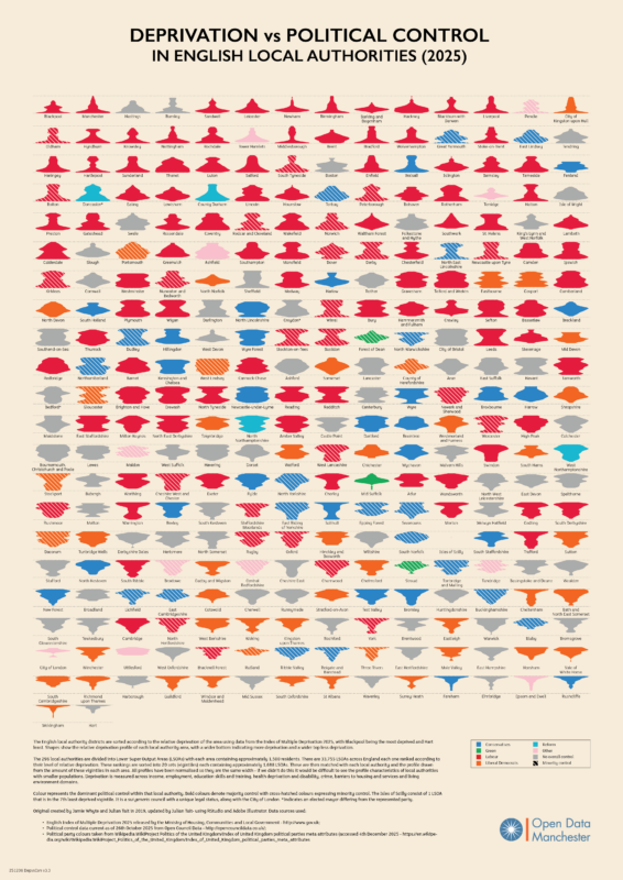
We are interested in the relationship between deprivation and democracy and have in the past produced sets of visualisations using the IMD. In 2018 that uses IMD15 data and 2019, we produced visualisations mapping the relationship between political control and deprivation to see if there are any patterns. Using a lava lamp plotting technique, we could show the relative deprivation profiles of all the local authorities in England. The 2018 and 2019 visualisations showed a striking correlation between deprivation levels and political control. More deprived communities tended towards Labour, whilst more affluent areas tended towards Conservative.
Our new visualisation using IMD25 data reveals that this picture is starting to shift. What was once a binary picture of local democracy—favouring either Labour or Conservative—now appears far more contested, with a revitalised Liberal Democrat presence, particularly in less deprived communities, alongside the rise of the Green Party and Reform UK.
The May 2025 local elections will be telling, and if this trend continues, we could see an increasingly diverse and distributed local political landscape.
The R script used to produce the plots and a high resolution version of the visualisation can be found on Github here.
As with the 2019 visualisation we are producing a limited run of 25 A2 Giclée printed posters for £30 including VAT and delivery to the UK. Let us know if you are interested in buying one through our website contact form. Monies from the poster support our community work.