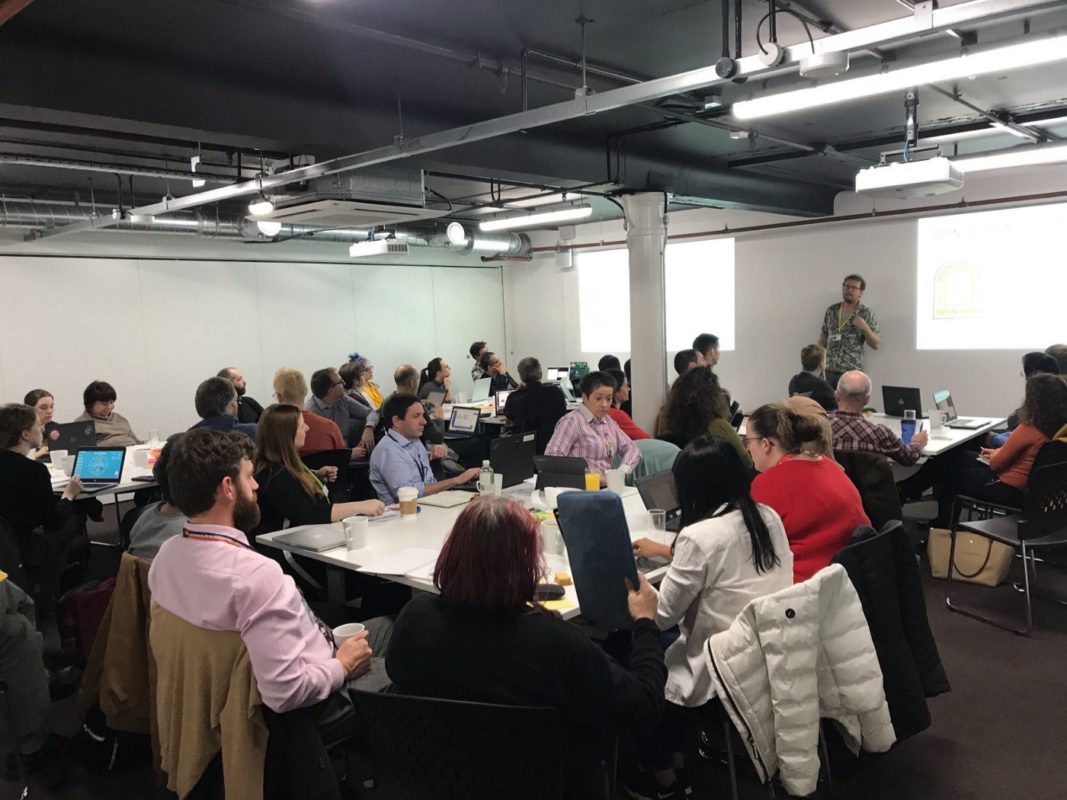
On 8th October, Open Data Manchester held an event at Federation House designed to give people the opportunity to explore the Indices of Deprivation, updated for 2019.
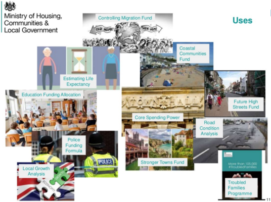
The Indices of Deprivation is a tremendously important collection of datasets, used to support all sorts of decisions made across central and local government, voluntary sector, and businesses. The datasets are updated approximately every four years, and they measure comparative deprivation in small areas in England, using many different factors, from air quality to educational attainment, and from housing quality to worklessness.
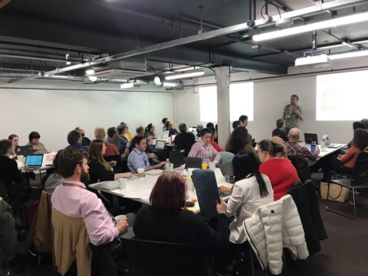
Attendees on the day were from a wide variety of backgrounds — local authorities, NHS, civic society, journalists, voluntary sector, and academics — and all came to hear from the experts that we had brought together from across the country to talk about the indices, and then take part in workshops and discussion.
Bowie Penney — Indices of Deprivation Lead at Ministry of Housing, Communities and Local Government
We were very grateful to Bowie Penney for visiting from London with some of his team to talk to us about the work he’s been doing to prepare the data. The Indices were constructed by OCSI and Deprivation.org based on a method devised by the Social Disadvantage Research Centre (SDRC) at the Department of Social Policy and Social Research at the University of Oxford back in 2000.
Bowie spoke about some of the methodology behind the indices, the media reaction to the release of the updated indices, and some examples of the way that the indices are used across the public sector.
Bowie also faced some difficult questions from the room — questions about universal credit (😬); whether there is much use of the individual domains and subdomains (not a lot, but Greater Manchester Fire and Rescue Service gave a good example); and the expectation on users to understand the methodology, and what you can and can’t do with the datasets (exactly what we’re trying to help people do through this and other events).
You can view Bowie’s slides here.
Alasdair Rae — Professor of Urban Studies and Planning, the University of Sheffield
Alasdair Rae is a prolific user of Indices of Deprivation data, and was this year commissioned by MHCLG to produce maps of all 317 local authorities, showing deprivation at lower super output level, as well as distributions, and other bits of information.
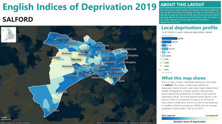
Alasdair was commissioned to produce these maps to try and avoid the need for all 317 local authority analysts (plus everyone else) spending time making their own, with varying degrees of competence. This principle of reproducible analytics is something that we at Open Data Manchester wholeheartedly support — if one person does something well, then giving it to everyone else means more time and effort can be spent on other, maybe more advanced, research and analytics.
Alasdair used QGIS to produce these profiles, and has made the files available so anyone can download them and reproduce or tweak his maps.
Alasdair also revealed some interesting findings from his work with the data. Whilst LSOAs are generally designed to be similar in terms of their population (around 1,700), there can be significant variance — the most populous LSOA is in Newham, with 9,551 people, while the least populous is in Liverpool at 523, which in itself raises interesting questions about the validity of the data.
You can view Alasdair’s slides here.
Bill Roberts — CEO, Swirrl
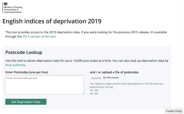
MHCLG publish the Indices of Deprivation data as a pre-formatted downloadable .xls file on GOV.UK. This is useful for people who want to look at the data in spreadsheet form, but can be difficult to work with programmatically.
MHCLG also publish the indices data on their Open Data platform — OpenDataCommunities, a linked data platform provided by Swirrl. Bill Roberts is CEO of Swirrl, and talked about the benefits of publishing the data this way, how to access the data, and some of the tools that have been built by Swirrl that make use of the data.
Of these tools, perhaps the most useful is the postcode lookup tool — where the linked data powers a facility whereby users can enter or upload a file of postcodes, and get indices of deprivation data back about those postcodes. This makes it easier for non-GIS experts to get deprivation information back about a group of things, such as schools, or GP practices.
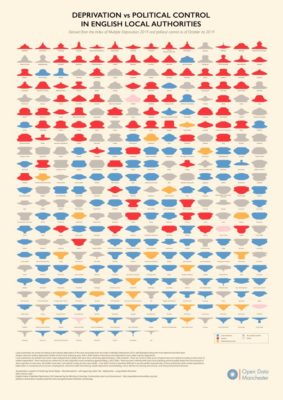
Programmatic access to the data is also what powered the Deprivation vs Political Control lava lamp plots that Open Data Manchester produced (see below).
Discussion Activity
Following the talks, attendees were invited to put forward topics for discussion — things that they wanted to use the indices for, or other things that they wanted to discuss.
These topics varied wildly, from people wanting to talk about indices of deprivation and arts funding, to others wanting guidance on practical usage of the data. It was really fascinating walking round and listening to the group discussions, hearing a computer science student and Church of England analyst talking about processing data with Python; a group discussing potential journalism pieces derived from the data, beyond the usual ‘xxx is the most deprived estate in England’; and a deep discussion about the underlying philosophy of the indices.
As well as bringing everyone together and facilitating the session, we at Open Data Manchester prepared some visualisations to help stimulate discussion. Lava lamp plots, showing deprivation profiles vs political control of local authorities were put up on the wall, as well as IoD domain-specific plots. You can view an image below, download the IMD plot from here, or alternatively, you can buy a giclée print for only £24, including postage and packing — get in touch if you’d like to purchase one!
So what’s next?
We really think that this was a positive event — to have so many people come together to learn about the indices from the experts, and then share their ideas is really well-aligned with what we want to do at Open Data Manchester.
There was definitely a lot of appetite for further digging into the data. While much of the focus of this first day was on the theory behind the indices, we think that there is definitely space for a session where we can look more critically at the methodology underpinning the indices.
We would also like to put on a session where we hack into the data a bit more, maybe explore the datasets and see what stories they tell about Greater Manchester.
Keep an eye out on our newsletter or twitter for details of those events as we schedule them.
And finally, if anyone else around the country wants to run a similar session, we’d definitely be up for supporting in some way, with contacts, materials, or even hands-on support. Let us know if you’re interested..!