By Jamie Whyte.
On Tuesday 14th May, we held an Open Data Manchester special — an election hack! Local elections had taken place across the country the previous week, and we wanted to hold an event where people could come together and have a look at the data generated, maybe get to understand it, and possibly even make something with it…
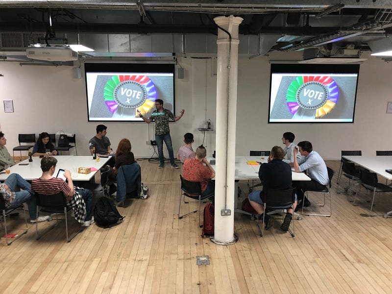
Doing a hack in a couple of hours is a challenge, because there typically needs to be a period of familiarisation with the data, coming up with ideas, forming teams, doing the stuff, and finally feeding back.
We started with some interesting things that other people had previously made with other election data, and then a quick spin through the datasets that we’d put on our ODM github repo for the event.
A couple of people at the hack suggested other datasets, and then everyone had a few minutes to have a bit of a discussion to come up with ideas. Post-its were collected in — the idea being we would group the ideas, and people could then form teams around the themes, but in practice each idea was very different from the others.
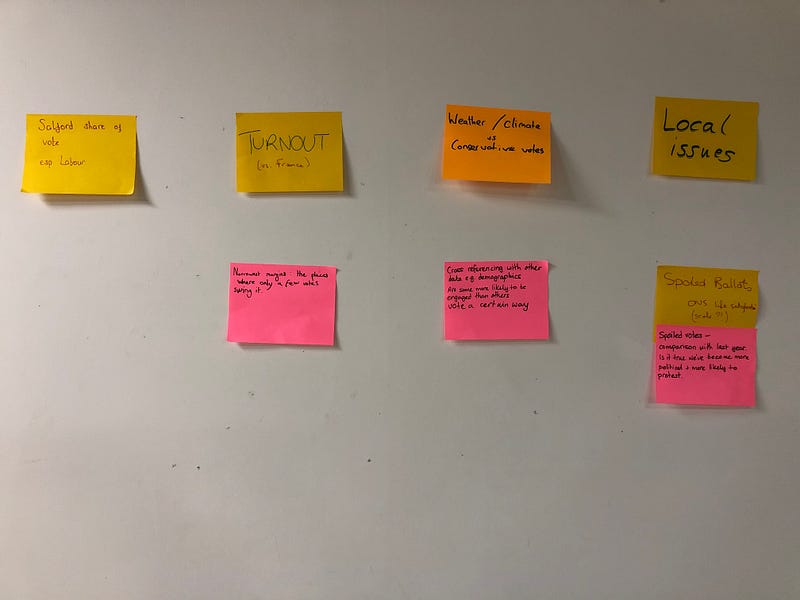
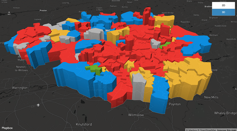
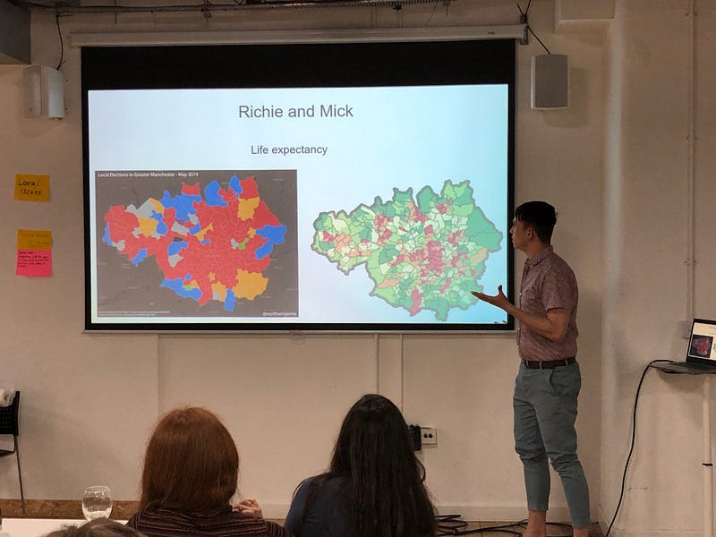
Once started, we had groups looking at making maps in Mapbox and R / Leaflet, we had people using MappingGM to visually compare the election maps with issues such as life expectancy, and deprivation, we had people trying to compare the Greater Manchester election with the French Election results and the ONS happiness survey. And we had people looking at specific issues, such as the most closely contested wards, and whether Labour’s vote share in Salford is decreasing.
At the end, everyone fed back what they’d found. Because time was tight on the night, findings were hastily prepared, but a reasonable summary is that:
- French election data is complicated and hard to work with.
- Labour’s vote share seems to have dropped below 50% for the first time in a while in Salford.
- People are getting generally happier, but there’s no apparent link with voter behaviour.
- Voting behaviour does appear to correlate with deprivation, and certain health indicators (though there are interesting exceptions).
- The tightest ward was in Tameside — Hyde and Werneth — where a mere 5 votes separated the 1st and 2nd placed parties.
- Trying to understand and munge data, and make a map in less than an hour from start to finish is a challenge.
While these outputs are probably not going to make it to the news, the most important thing is that we brought people together to allow them to explore what we think is an important topic, with some really interesting datasets. Who knows what we could have achieved with a little more time…
But most important of all, we had fun.
Follow us on Twitter or sign up to our monthly mailer to stay up to date with upcoming events and news from the open data community in Greater Manchester.