Choropleth (not chloropleth, as I called them for months) maps are maps that colour different areas according to some data, using different strategies for assigning colours. In the UK, choropleth are usually made using existing geographical divisions — counties, parliamentary constituencies, wards, or lower super output areas, etc. These are pretty easy to do, and on the face of it, they look pretty good, but they are NOT*. These things aren’t uniform in size, so bigger areas can dominate a map, giving the impression that a particular colour, and therefore data point, is more prevalent.
This has been explored in great detail before, so I’m not going to overdo it here, but the hexagonal approach taken by some people and organisations towards visualising elections data is my preferred way of doing it (cartograms make me feel uncomfortable).
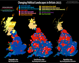
To do that, each constituency is turned into a hexagon. There’s a really good post by ODI Leeds about how they did it. ODI Leeds have also done some work similar to this with electoral wards in Leeds, Manchester, Birmingham, and a few other cities.
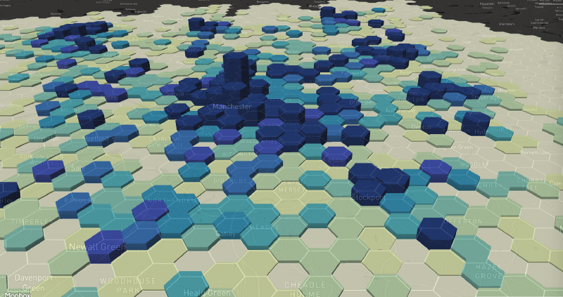
But another way to use hexagons in cartography is to create a mesh that covers a particular geographical area. This is useful where the data is available at point level, and we want to show counts by area, without the problems of using standard geographies.
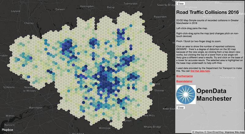
At OpenData Manchester, we’ve been looking at open road traffic collision data, and how best to show it on a map. As well as just showing the individual points, we’ve also been looking at hex bins, and it’s a pretty effective way of visualising the data. To help other areas do similar, we’re going to show how to create a hex layer from another geographical area, ready to be filled with data.
To do this, we need a couple of things:
- A geographic information system (GIS). I’m using QGIS, because it’s good, and it’s free. I’m sure the others will do similar things.
- A geographical area (I’m going to use Greater Manchester, but anywhere will work.
I’m going to assume some knowledge of QGIS here, because otherwise we’ll be here all day.
Open QGIS up and start a new project. We’re going to use a plugin to make the hex layer, called MMQGIS, which is a collection of python-based vector processing tools. Go to Plugins, and install it if you don’t already have it, then enable it.
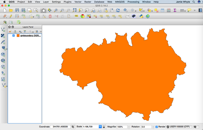
Next — we need to get our GM Boundary into QGIS. I’ve put the geoJSON on the GitHub page for this thing here, so feel free to pull it down if you’re doing this as you go along.
Add the file as a new vector layer, and you should have something that looks like this:
Now that we’ve got the shape of Greater Manchester, we want to create a mesh of hexagons to go over the top of it. To do this, click on the MMQGIS menu at the top of the screen. If you don’t have this, go to plugins and make sure you have MMQGIS installed and enabled.
Choose Create > Create Grid Layer, and you should be faced with this menu
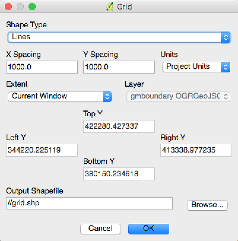
First, we need to change the destination of the Output Shapefile. This just needs to be somewhere temporary, as we’re not going to need it (I usually use my desktop 🙄).
Then, change the Shape Type to ‘Hexagons’, and then you may need to fiddle with the other settings to get the right size hexagons for what you want to do.
These settings worked for me but YMMV:
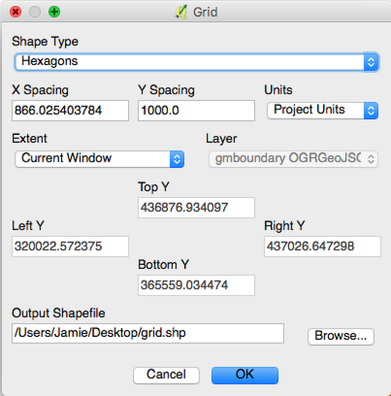
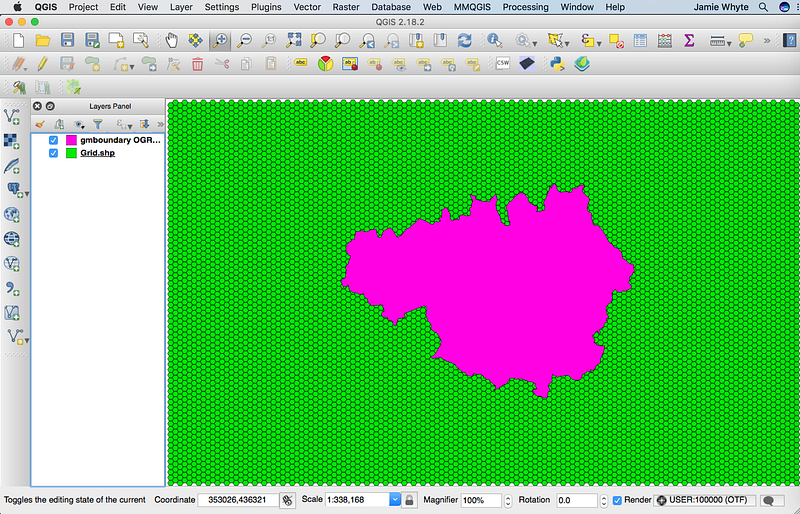
So once you’ve clicked OK, you should see this:
Now we have two layers that have different co-ordinate reference systems, so we need to make them the same. We’re going to save the hex layer with the same CRS as the GM boundary, which is EPSG:4326 / WGS 84. So right click on the grid layer on the left panel, and click ‘Save As…’. You’ll get this menu.
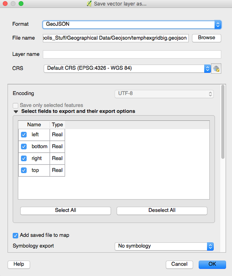
Change the filename, and the CRS to EPSG:4326 — WGS 84 , then click ok. This will add a new layer to the map, which looks exactly the same as the other one, but isn’t. You can now delete the old hex layer from QGIS now.
What we now need to do is get rid of all the hexes that are around the outside. We don’t need them for what we’re doing in Greater Manchester (sorry Cheshire, Lancashire etc!).
To do this, select the GM boundary, and then in the Vector menu, click Research Tools > Select by Location. This tool allows us to select the features in one geographical layer, based on the selected features in another. Here’s the menu:
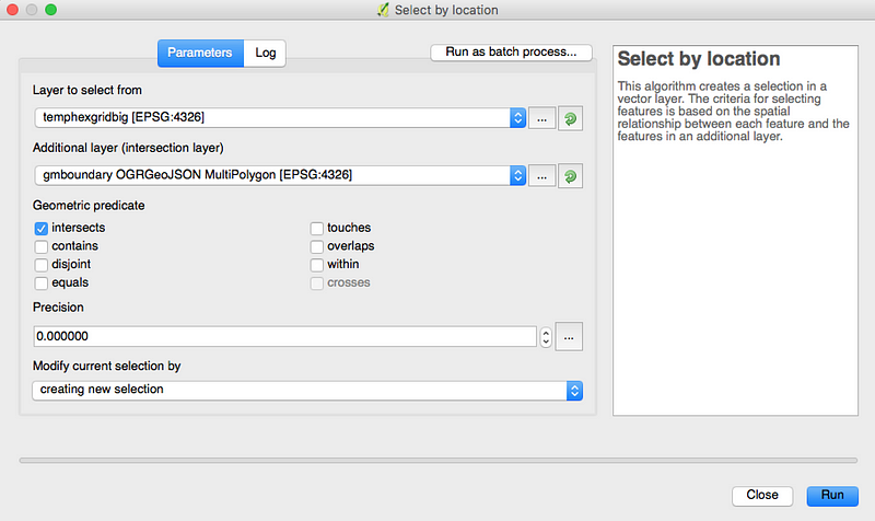
If we select the hex layer in the top dropdown, and the GM boundary in the bottom dropdown, then tick the intersects box, we get this:
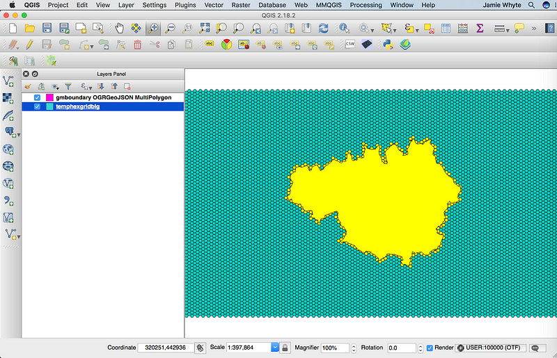
Notice how the GM boundary has some hexagons highlighted around it? If we turn off the GM boundary layer, we get this:
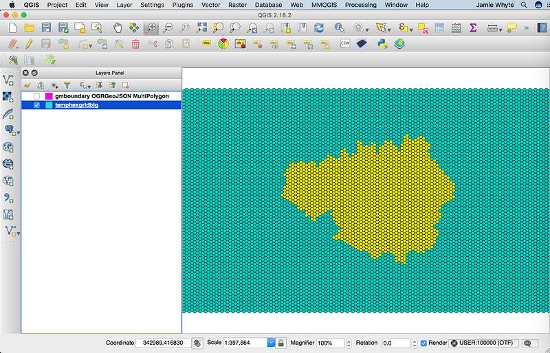
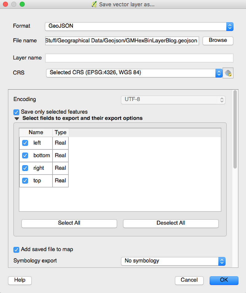
Hooray! It’s Greater Manchester made up of little hexagons. Before we do anything else, we need to save just those hexagons. Right click on the hex layer in the left hand panel and select ‘Save As…’. Save this as geoJSON, making sure you check the ‘Save only selected features box’:
Your brand new hexbin file is very nearly ready to use. We just need to add an ID to each one so that we can use it in web-mapping.
To do this, right click on the layer in the left hand panel, and choose Open Attribute Table. This will open something that looks like this:
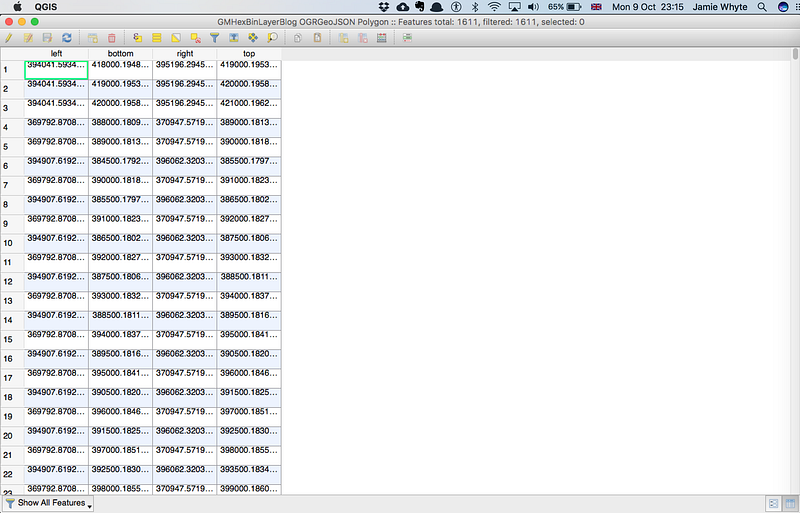
We want to add another field to this table, with a unique ID in, that we can use to attach data to. If we click the pencil at the top left, we can enter editing mode:

Once editing mode is enabled, if we click the abacus:

We can populate a calculated field.
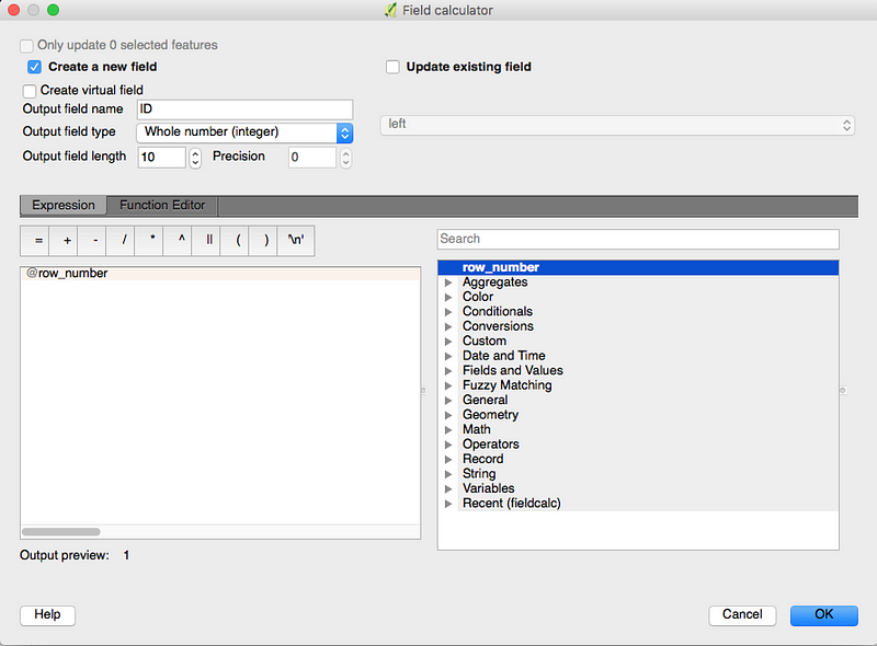
Here, we are choosing to create a new field, called ‘ID’, and give it the value ‘row_number’, which is a unique number for each hexagon.
Our final table looks like this:

And that’s it! We’ve turned a specific geographical area into mesh of hexagons!
I’ll follow this up with a post that shows how to use point-level data to colour a hex map, using the Road Traffic Collision Data from the Department of Transport. But if you want to explore yourself, the data is here, and you need to load it into QGIS as a delimited text layer, then use the vector analysis tools to do counts by polygon.
If there’s anything of this that you can do better — please shout out. I feel like I hacked this together and got lucky, so feedback and corrections most welcome..!
- This is me hyperbolising — choropleths are still a pretty good way of visualising data, just handle with care.