In July 2020, we were delighted to be part of a team awarded ODI Stimulus Fund money to develop an open data standard for public information about UK recycling. This has since developed into the Innovate UK-backed Plastics Packaging Portal, which will combine two waste standards. Dsposal is still collaborating with us on this, and here data research intern Jamie Dumayne and CIO Tom Passmore explain how their work on visualising Household Waste Recycling Centres has developed. Follow the links to find part one, part two and part three of our series on UK recycling services.
–––
From the start of working on these maps of Household Waste Recycling Centres (HWRCs) across the UK, we’ve discussed where adding additional data could improve the usefulness of the map.
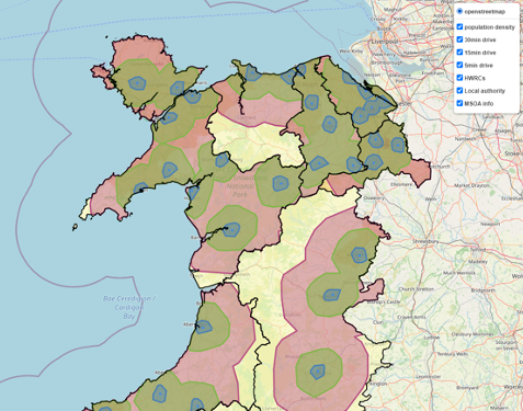
A key dataset that would pair well with HWRCs is population density – so we would be able to see how much of a local population is within a five, 15 or 30-minute driving distance of each HWRC.
Getting the data
To get started on this, we obtained a Middle Layer Super Output Area (MSOA) dataset, which gives population data for subareas within a HWRC local authority. The coordinates of the borders for each MSOA were also found.
When the population is combined with the area of each MSOA, the population density can be calculated. Doing this offers more accurate representation of different areas, especially because the map both includes rural and urban areas.
To begin with, we tried grouping and colouring the population densities ourselves. However, this is a slow process and has to be restarted for each dataset (i.e. England, Northern Ireland, Scotland and Wales).
Building a choropleth
Luckily, Python has some functions for this exact purpose. Folium, a Python library used for visualising geospatial data, has a built-in function to make a choropleth (a map in which a set of pre-defined areas is coloured in proportion to a statistical variable).
The choropleth function makes it much easier to work with displaying statistical variables, as intervals and colour schemes can be set easily.
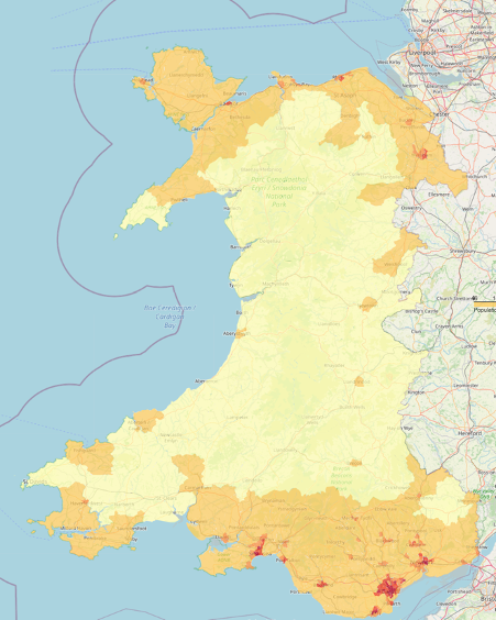
In the case of Wales, the intervals for the colours to be used in the legend were defined using quartiles at 10%, 50%, 70% and 95%. These figures are changed when making maps of the other three countries.
Combining all the data onto one map
One thing we wanted to be able to do was show the driving distances and population density on the same map – so you can quickly see how many people share UK recycling services.
Folium has the option to add objects to a map with layers that can be toggled on and off, however, when a choropleth is added as a layer, the legend doesn’t appear.
Fortunately, Folium has an alternative way to display information that is useful to fix this – in our case now, when a user holds their mouse over a MSOA area, the population density is displayed as a popup, along with the name of the MSOA.
Issues with the map
If you’ve been following this four-part series of blogs, you might have noticed that nothing works perfectly first time.
One issue we came across this time is that there is different resolutions of MSOA data. Initially we used a dataset that was very fine, which resulted in a larger file size.
This was improved upon by getting slightly lower resolution data for England and Wales. The file size for the Wales map was reduced from 120mb to 30mb. At 120mb a map is slow to open and move around, whilst at 30mb the map is very responsive.
So far we only have the lower resolution data for England and Wales, so the next step is to do the same for Northern Ireland and Scotland.
At present, the choropleths showing population density have to be kept separate from the HWRCs for each of these countries, otherwise the file size becomes too large to use.
Another improvement we would like to make to the choropleth is to use a more accessible colour scheme.
There is a colour scheme in Python called Viridis, which has been designed to be clear for people who are colour blind, but the choropleth function within folium only has a limited number of selectable colour schemes and doesn’t include Viridis.
There is very little documentation on Folium and even less on the choropleth function. However, it is built on top of leaflet.js, so there may be hidden functions within this that can improve the colours of the map.
What’s next?
Although this map is an amazing tool for understanding UK recycling services at its current stage, there is always more that can be done. The next step would be to add more layers of data to the map.
Not all HWRCs are the same – some accept waste that others don’t – materials such as asbestos are not widely accepted. Some HWRCs have limits as to how much of a particular material can be accepted.
Adding these extra datasets to the map would add layers of richness, and allow data visualisation that is not currently available.
This is the last in a four-part series – for previous blogs – check out:
- why we started with Wales
- how we took what we learned to make our first map better
- how we applied this to the rest of the UK